zenit-stp
alfa-bank
product designer
zenit-stp
alfa-bank
product designer
zenit-stp
alfa-bank
product designer
zenit-stp
alfa-bank
product designer
zenit-stp
alfa-bank
product designer

about
project
Zenit STP is a manufacturer of professional lighting and electronic equipment
The company focuses on innovation and delivers custom lighting solutions for industrial and commercial projects.
Enhanced customer return rate
20%
Reduced order processing times
x2,7
Fewer inquiries to the call center
39%
Lead percentage from website
33%
my role
I led the end-to-end design of the new website, including research, information architecture, and interface creation. I worked closely with managers and developers to align the product’s UX with business goals and improve the overall customer journey.
problems
• Customers struggled to find product info, which increased support calls • Long order processing times reduced satisfaction and repeat purchases • Low product engagement led to missed sales opportunities
business goals
• Improve documentation access by making structure and navigation clearer • Reduce call center load by providing all necessary information on the website • Create a simple catalog to help users find, compare, and choose products faster
actions
• Analyzed competitors to understand market standards and find improvement points • Restructured product documentation for easier navigation • Added a faster search experience to help users locate information quickly • Updated product pages with clear descriptions and visuals
results
• −45% product selection time • −39% call center load • ×2.7 faster order processing (3 weeks → 1 week, 10 days → 3 days) • +15% average purchase value • +20% customer retention • 21% of users requested a price after viewing documentation
mood
In the first meeting, I found out the client wanted a website inspired by Swiss design. After researching the style and discussing options, I chose simple geometric shapes, a minimalist color scheme, and lots of white space to create a clean, modern look
I also made sure the site was functional and presented the client's products clearly to their target audience, designers and planners. The final result went beyond what the client initially expected.


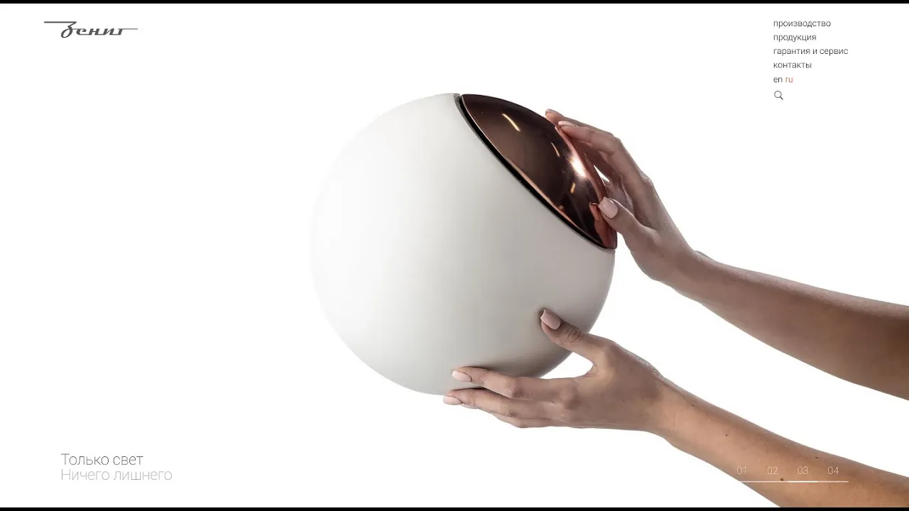
main page
Minimal aesthetics, maximum impression
he main page begins with a full-screen slider featuring interior images that set the mood and make a strong visual impression, emphasizing the brand's aesthetics and drawing users in from the first scroll.
main page
Minimal aesthetics, maximum impression
he main page begins with a full-screen slider featuring interior images that set the mood and make a strong visual impression, emphasizing the brand's aesthetics and drawing users in from the first scroll.
main page
Minimal aesthetics, maximum impression
he main page begins with a full-screen slider featuring interior images that set the mood and make a strong visual impression, emphasizing the brand's aesthetics and drawing users in from the first scroll.
main page
Minimal aesthetics, maximum impression
he main page begins with a full-screen slider featuring interior images that set the mood and make a strong visual impression, emphasizing the brand's aesthetics and drawing users in from the first scroll.
main page
Minimal aesthetics, maximum impression
he main page begins with a full-screen slider featuring interior images that set the mood and make a strong visual impression, emphasizing the brand's aesthetics and drawing users in from the first scroll.
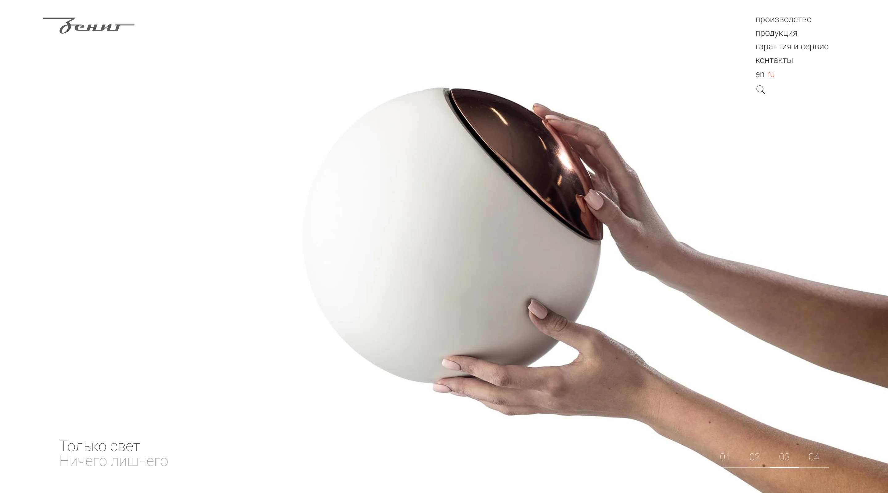

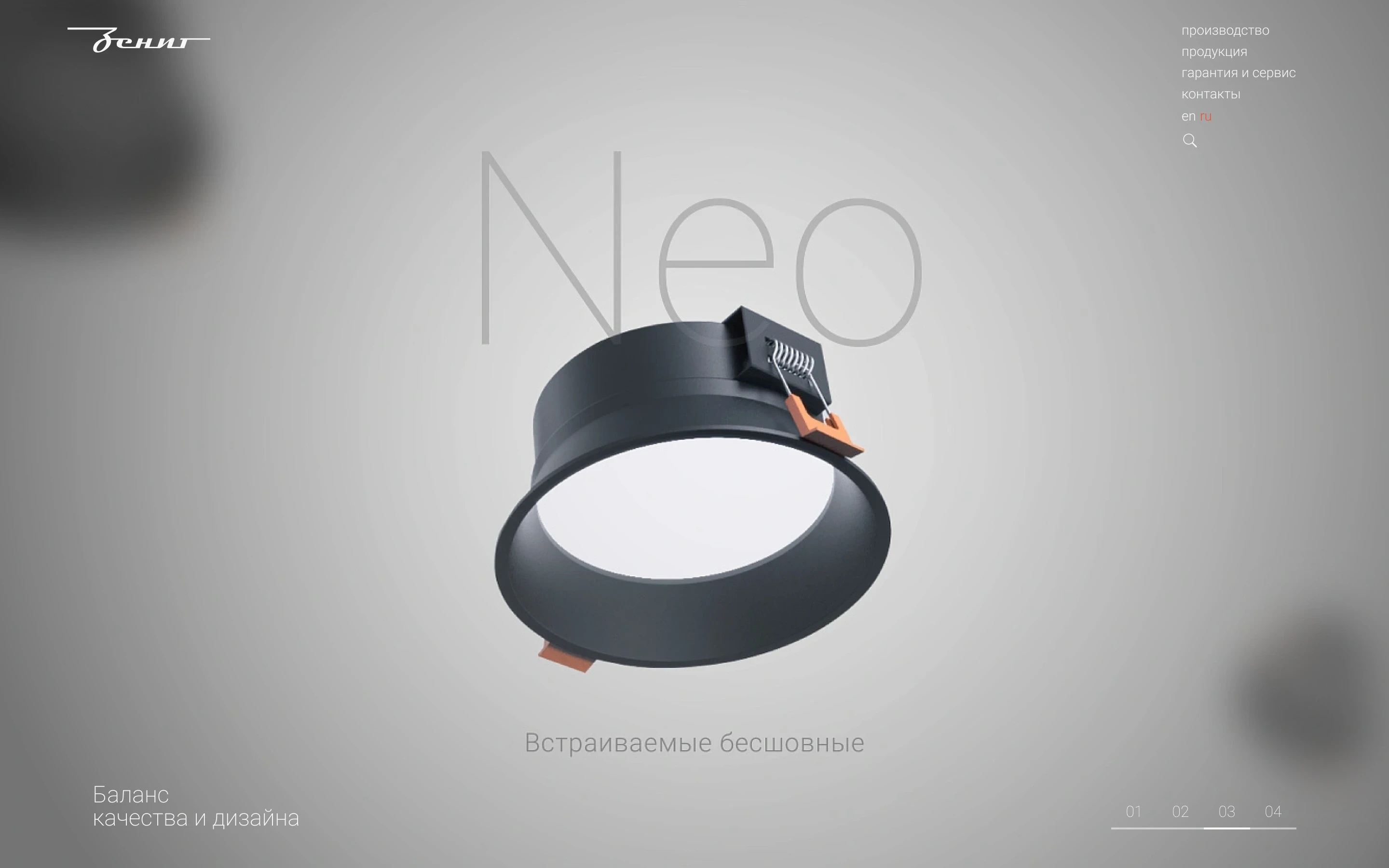
animation
The second and following screens of the main page were the most engaging and challenging parts of the project. Each section required careful attention to detail and creative decisions to bring the visual and interactive experience to life. These are best seen in action rather than described.
menu
I moved all secondary elements (search, language switching, and social links) into a full-screen menu to keep the interface minimal and visually uncluttered.
menu
I moved all secondary elements (search, language switching, and social links) into a full-screen menu to keep the interface minimal and visually uncluttered.
menu
I moved all secondary elements (search, language switching, and social links) into a full-screen menu to keep the interface minimal and visually uncluttered.
menu
I moved all secondary elements (search, language switching, and social links) into a full-screen menu to keep the interface minimal and visually uncluttered.
menu
I moved all secondary elements (search, language switching, and social links) into a full-screen menu to keep the interface minimal and visually uncluttered.
error
Some pages are missing, and some links lead to “dead ends.” A well-designed error page is essential because it helps users navigate back to the catalog or homepage. Initially, the project included plans for a dark theme for the entire site, but the idea was later set aside. However, the ability to switch between dark and light themes became a unique and fun feature of the 404 page.
catalog
The catalog page is minimalist and clean, letting users focus on the products.
Categories like "pendant," "ceiling recessed," and "wall recessed" make navigation straightforward. Spacing is carefully adjusted so the content is easy to read without feeling cluttered.
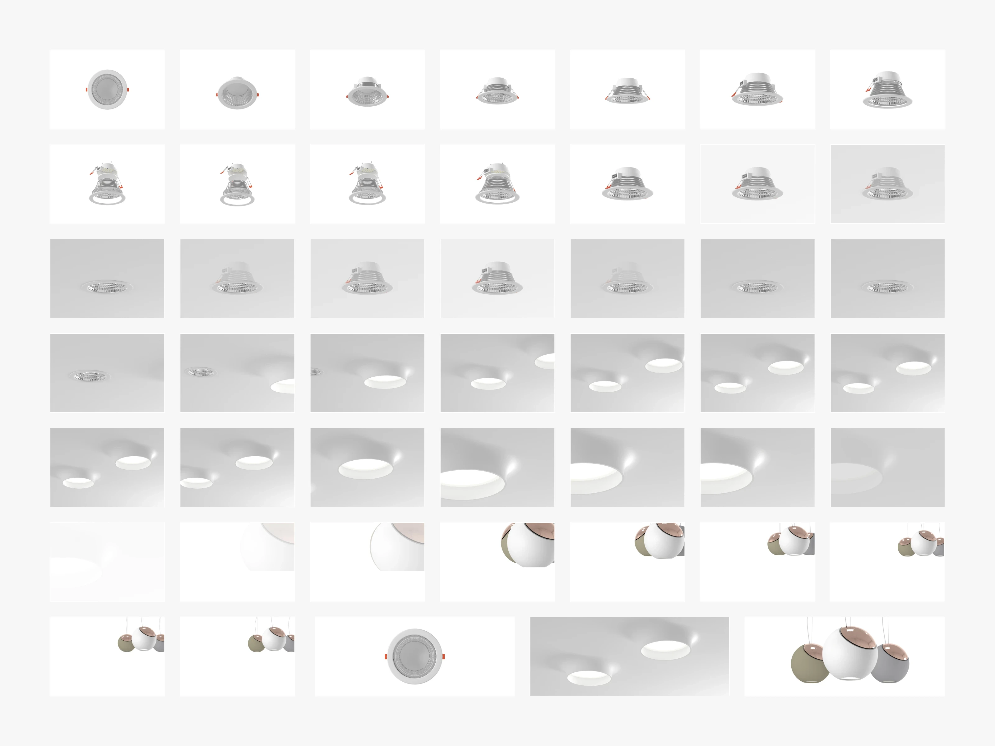
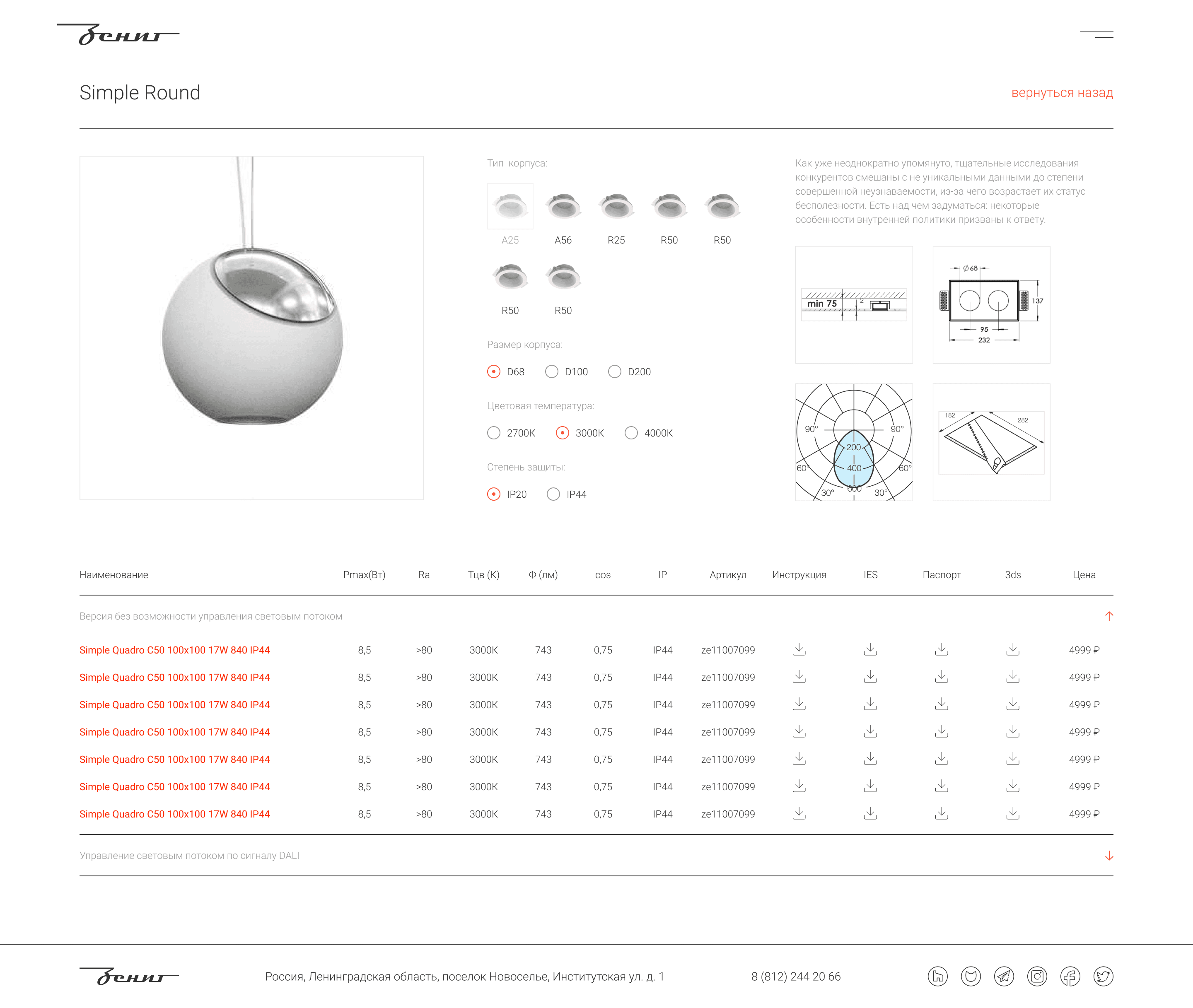
product card
The product series page lets users explore all available device variations in detail, adjust housing type and other parameters to find the right fit, and download documentation or 3D models directly.
mobile
Each page works well on any device
The site is fully responsive across all screen sizes. Users can comfortably browse the catalog, view product details, and download documentation from their phone or tablet. As a result, mobile users now make up 23% of total traffic.
mobile
Each page works well on any device
The site is fully responsive across all screen sizes. Users can comfortably browse the catalog, view product details, and download documentation from their phone or tablet. As a result, mobile users now make up 23% of total traffic.
mobile
Each page works well on any device
The site is fully responsive across all screen sizes. Users can comfortably browse the catalog, view product details, and download documentation from their phone or tablet. As a result, mobile users now make up 23% of total traffic.
mobile
Each page works well on any device
The site is fully responsive across all screen sizes. Users can comfortably browse the catalog, view product details, and download documentation from their phone or tablet. As a result, mobile users now make up 23% of total traffic.
mobile
Each page works well on any device
The site is fully responsive across all screen sizes. Users can comfortably browse the catalog, view product details, and download documentation from their phone or tablet. As a result, mobile users now make up 23% of total traffic.


manuals
I created universal templates for manuals and other documents, which the website automatically generates based on the user’s current page
This simplifies access to relevant information, making the document retrieval process fast and user-friendly
manuals
I created universal templates for manuals and other documents, which the website automatically generates based on the user’s current page
This simplifies access to relevant information, making the document retrieval process fast and user-friendly
manuals
I created universal templates for manuals and other documents, which the website automatically generates based on the user’s current page
This simplifies access to relevant information, making the document retrieval process fast and user-friendly
manuals
I created universal templates for manuals and other documents, which the website automatically generates based on the user’s current page
This simplifies access to relevant information, making the document retrieval process fast and user-friendly
manuals
I created universal templates for manuals and other documents, which the website automatically generates based on the user’s current page
This simplifies access to relevant information, making the document retrieval process fast and user-friendly


scroll on top
scroll on top
scroll on top
scroll on top